Introduction
For nearly 50 years, Infotech has been a leading SaaS solutions provider for the infrastructure construction industry. Informed by our DOT relationships and decades of experience, Infotech develops software solutions that bridge the gap between owners, consultants, contractors, and other project stakeholders who build our country’s infrastructure. Infotech’s enduring commitment to trust, innovation, and transparency has shaped our development and partnerships to this day.
However, like the rest of the world, Infotech has continued to mature, grow and develop, yet the brand remained static. As we evolved, Infotech’s marketing team had to consider whether our brand still conveyed the value we provide to the modern world. We knew we needed to make a new splash in the world of infrastructure with a fresh campaign, to not only reinforce the company’s standing in the industry to our partners and community, but also to make a single question clear: who is Infotech?
Brand Tagline Exploration
To answer this question, we first needed a tagline that captured our work in as few words as possible. This was a unique challenge, as our infrastructure solutions, while rooted in data, ultimately serve a larger purpose: getting people on the road as efficiently and safely as possible. We needed to find a way to not only clearly communicate what our products do, but also reflect our company’s values.
In the end, we split it down the middle for one product tagline, and one brand tagline:

Engineering connections, from bid to build, speaks to what we specialize in, with connectivity being at the heart of our products. It speaks to what we do, but also carves out our niche as a builder, connector and purveyor of construction data workflows.

We built this for you, speaks directly to the people crucial to our success since our founding in 1977. While it references the industry, it represents a greater purpose behind our products and services while keeping our solutions human-centric.
These taglines, while serving distinct goals, collectively represent Infotech’s core mission: bridging the gap between data and your needs.


Brand Visuals
Once we solidified our taglines, we began updating the brand visuals to match our new identity.

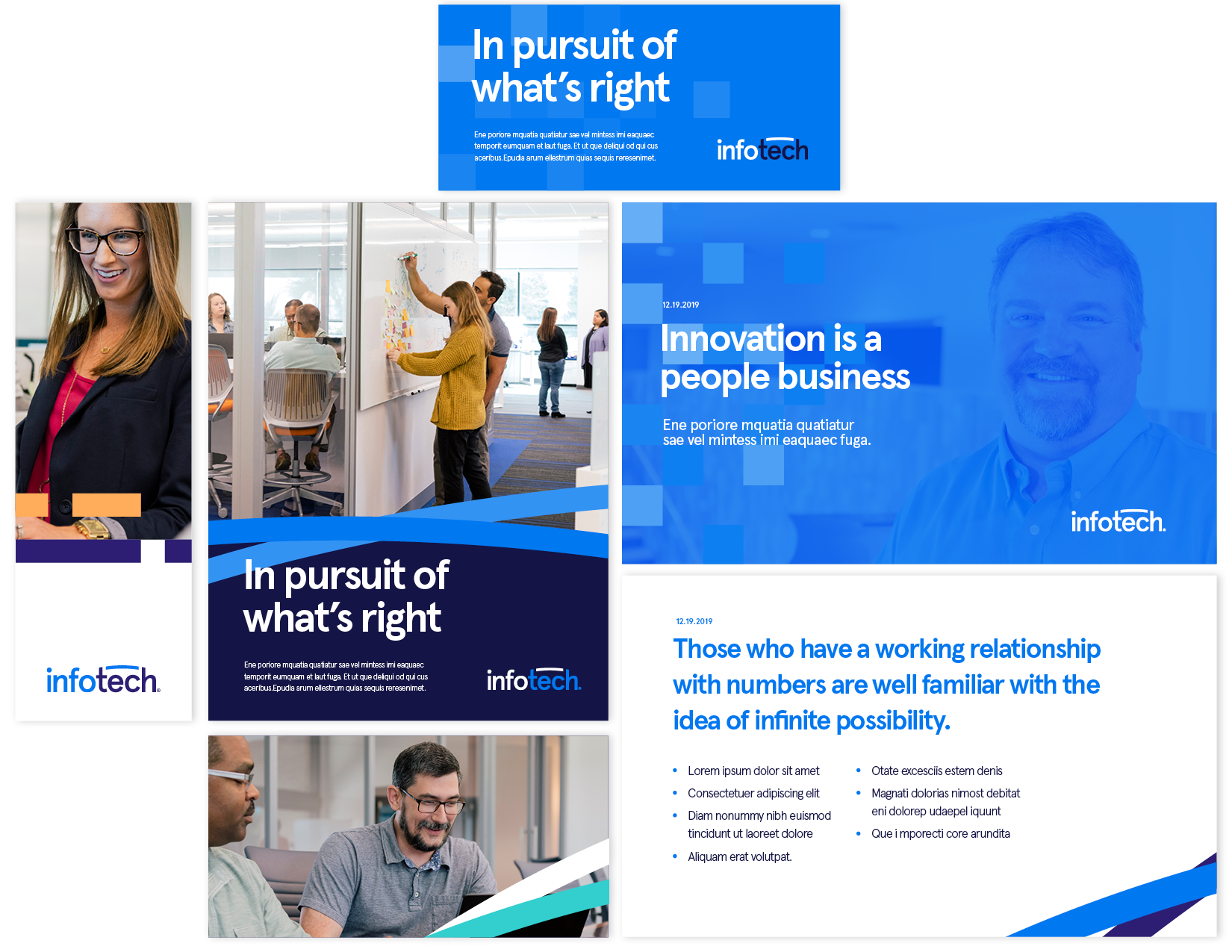
Most of us are familiar with 2019’s brand system, which included a new logo, brand colors, and typeface. While these still reflect Infotech, this refresh aimed to enhance the brand visuals to better represent the multifaceted nature of modern data, where it’s often complex, layered, and in some cases, can get quite messy.

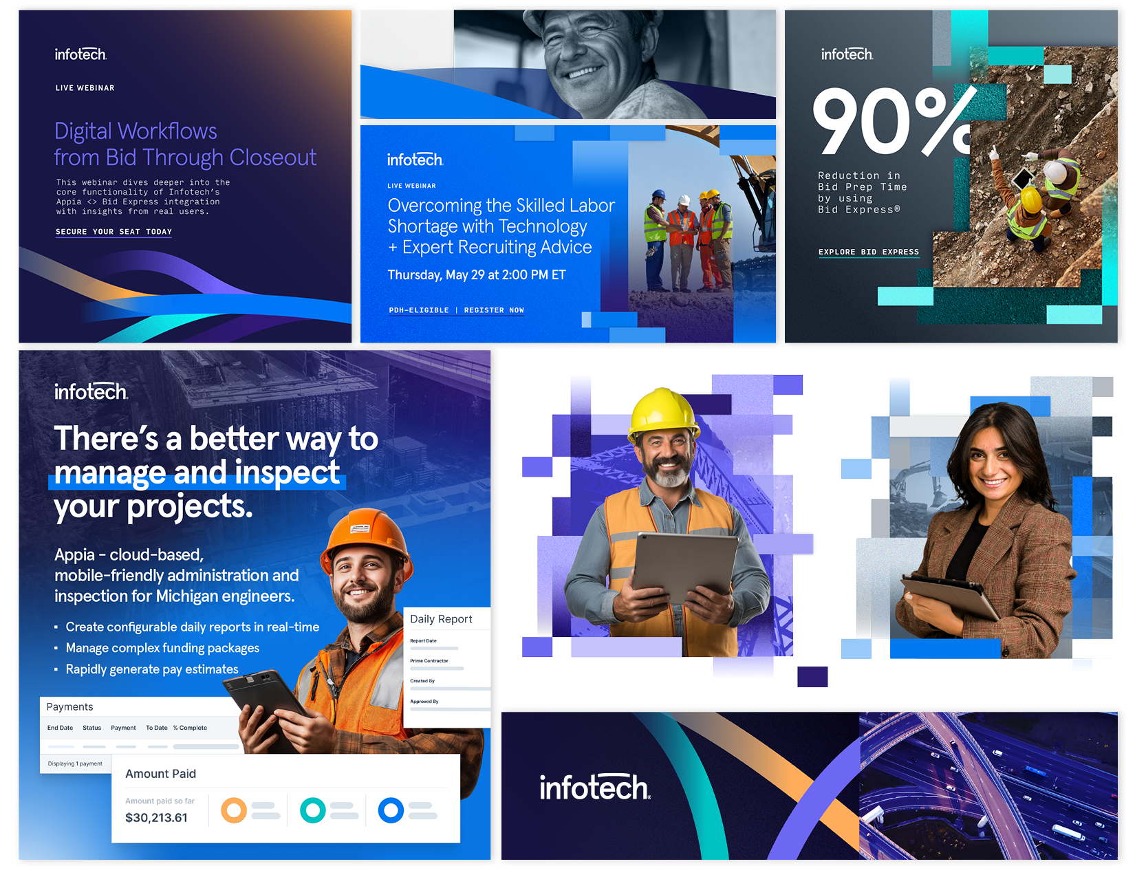
The stretched rectangular pixels in our brand refresh represent the complex and often unstructured nature of modern data.
Instead of fitting neatly, data builds upon itself to form a more complete picture.
Our world depends on connecting these pieces, a concept we visualized by expanding the bridge in our logo to signify how our solutions link these data points together, subtly shaping the world around us in ways you may not immediately recognize.

Redesigned Website
After a few more iterations of the brand elements, it was time to implement the assets on www.infotechinc.com, where our current and potential users converge. The website had to speak directly to our core solutions for potential users in a clear, digestible way, while keeping current users engaged when viewing our products.
The homepage underwent a complete redesign to directly address our audiences through role-specific pages tailored for local agencies, state agencies, engineering consultants, and contractors. The product login pages were then reformulated to place our users at the forefront, featuring visual previews of our solutions’ capabilities, alongside a standard login button to streamline logging in.
Much like our brand, the website will continually evolve to effectively convey our narrative and, more importantly, serve our people.

The Road Ahead
Infotech is now moving forward with two new taglines, a fresh visual identity, and an improved website, now reflecting the forward-facing, ever evolving nature of our company and industry.
Despite these changes, it’s important to reiterate that this is not a rebrand, but simply a refresh. Infotech’s core foundation is the same, driven by the spirit of our founders that left everything behind to make something of their own. This reintroduction into the market attests to our ongoing commitment to our customers, stakeholders, and the principles that have guided us.
We invite you to experience this new refresh to the fullest by exploring our updated site and connecting on LinkedIn, where we’ll continue to post updates about this exciting new chapter for Infotech.
Authors

Hector Del Valle-Sosa
BRAND MANAGER
Hector oversees Infotech's visual communications across digital and print platforms, encompassing advertising, graphic design, and brand management both internally and externally.

Janice Ji
MOTION DESIGN SPECIALIST
Janice works with video and design to create animated, visual narratives for the marketing team.